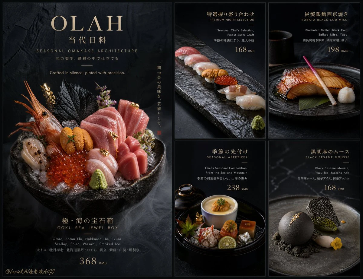
Create an ultra-premium five-panel restaurant campaign board for OLAH Japanese Dining, preserving the same core menu skeleton of one large hero panel on the left and four smaller supporting panels arranged in a strict 2x2 grid on the right, but radically reconstruct the entire visual world into a colder, darker, more architectural luxury expression. The final image must feel like a flagship Japanese fine-dining brand poster built from black stone, ink shadow, restrained ceramics, and sculptural plated cuisine. It should feel less like a conventional menu and more like a world-class art-directed restaurant campaign: hyper-real, minimal, expensive, precise, and visually unforgettable.

Core concept:
The board should present OLAH as an elite contemporary Japanese dining house where every dish feels like a ritual object placed in a controlled black-stone environment. Preserve the left-large-right-four-small menu structure, but transform the overall atmosphere into a colder, more ceremonial, more museum-like visual system. The food remains the hero, yet the surrounding world should feel like dark ink, volcanic stone, brushed metal, smoked lacquer, and quiet Japanese spatial discipline. The result must feel like a high-end omakase institution with severe restraint and absolute confidence.

5-panel structure:
Use a refined campaign board with:
one dominant large hero panel on the left,
four smaller supporting panels on the right arranged in a clean 2x2 luxury grid.
All five panels must share one highly controlled lighting language, one cold premium background system, one typography hierarchy, and one elevated brand identity.
The left hero panel acts as the flagship commercial anchor.
The four right panels act as precise menu-feature portraits.

Panel 1, left hero panel:
Show one unforgettable signature OLAH dish as the central flagship hero, but reconstruct it into a darker and more sculptural presentation.
Best direction:
an ultra-luxury omakase seafood arrangement staged in a matte black stone bowl or carved dark ceramic vessel, featuring bluefin toro, Hokkaido uni, ikura, botan ebi, otoro folds, smoked ice accents, black shiso, micro herbs, and restrained gold-toned garnish.
The composition should feel abundant yet disciplined, like edible jewelry placed inside a black architectural object.
This panel must contain the main brand title, a short refined dish description, and a premium price block.

Panel 2, top-right:
Feature a cold precision sushi or nigiri selection arranged on a long charcoal stone slab, with exceptional fish slicing, clean rice geometry, and minimal garnish. The dish should read like a study in proportion, silence, and craft.

Panel 3, top-right second:
Feature a luxury hot course such as robata black cod miso, binchotan-grilled wagyu, or charcoal fire-kissed king crab, plated on dark ceramic with subtle smoke traces, lacquer reflections, and restrained side condiments.

Panel 4, bottom-right:
Feature a refined appetizer or seasonal composition such as uni chawanmushi, oyster with yuzu gel, crab with citrus emulsion, or a cold kaiseki starter arranged in a dark lacquer tray or black stone vessel with high precision and quiet luxury.

Panel 5, bottom-right second:
Feature a high-end Japanese dessert course reconstructed in a colder minimalist way, such as black sesame mousse, matcha ash dessert, yuzu ice sphere, or a wagashi-inspired plated finale on matte black ceramic with one precise accent color. It should feel elegant, restrained, and collectible.

Food realism:
Render all dishes with absolute culinary realism:
true sashimi translucency,
precise knife work,
correct rice grain texture,
natural fish moisture,
subtle steam or smoke where needed,
controlled sauce viscosity,
delicate garnish edges,
real ceramic and lacquer reflections,
premium stone surface detail,
and Michelin-level plating fidelity.
The food must feel luxurious, physically edible, and chef-driven, never generic or decorative for decoration’s sake.

Plating direction:
Push the plating into a colder, more sculptural Japanese luxury system:
matte black ceramics,
ink-dark stoneware,
charcoal slate slabs,
deep lacquer vessels,
brushed metal accents,
low-profile trays,
quiet negative space,
small side vessels,
micro herbs,
and exact ingredient placement.
Every plate should feel composed like a gallery object.

Typography:
Use a premium bilingual restaurant typography system integrated elegantly into the layout.
Main English title:
“OLAH”
Chinese secondary title:
“当代日料”
Supporting English hero copy direction:
“Seasonal Omakase Architecture”
“Crafted in silence, plated with precision.”
Each right-side panel should include:
dish name,
one-line elegant English description,
price information in a highly refined consistent layout.
Typography should be sparse, sharp, beautifully spaced, and never bulky. Use minimal official-style brand coding and a cold luxury menu hierarchy.

Price direction:
Include clearly designed premium price labels with one unified currency logic, such as:
168 / 198 / 238 / 298 / 368
Prices must feel integrated and elevated, never like discount tags.

Background and atmosphere:
This is the key reconstruction.
Keep the board structure unchanged, but rebuild the entire background into a colder luxury environment:
ink-black stone,
deep charcoal gradient,
subtle mineral wall texture,
quiet slate surfaces,
soft shadow voids,
smoked glass reflections,
and restrained Japanese architectural calm.
No casual restaurant context, no bright tabletop clutter, no warm cozy mood. Everything should feel controlled, cold, expensive, and brand-flagship.

Lighting:
Use extremely refined soft-commercial food lighting with colder tonal control and precise highlight discipline.
The hero panel should have slightly stronger sculptural illumination.
The smaller panels should remain consistent but quieter.
Reveal fish texture, ceramic material, gloss, smoke, and garnish detail with subtlety.
Shadows must remain soft, open, and luxurious, never muddy or harsh.

Color direction:
Use a restrained luxury palette:
ink black,
charcoal gray,
stone slate,
warm ivory ceramic accents,
toro ruby,
uni gold,
ikura amber,
wasabi green,
soy brown,
soft metal silver,
and very limited natural garnish color.
The palette should feel cold, premium, and deeply appetizing without becoming loud.

Mood:
luxurious, minimal, cold, precise, chef-driven, architectural, elegant, ritualistic, Japanese fine-dining, globally upscale

Rendering style:
ultra-premium Japanese restaurant campaign board, five-panel luxury menu layout, one large left hero panel and four right feature panels, cold ink-black stone environment, hyper-real plated Japanese cuisine, refined bilingual typography, elegant dish descriptions and prices, sculptural ceramics, 8k, world-class commercial food image quality

Negative prompt:
cheap menu design, buffet presentation, casual sushi takeout look, warm cozy bistro mood, cluttered table, plastic food texture, weak plating, oversized text, discount-poster feel, noisy background, low-detail fish, flat lighting, generic restaurant flyer, low-end menu board