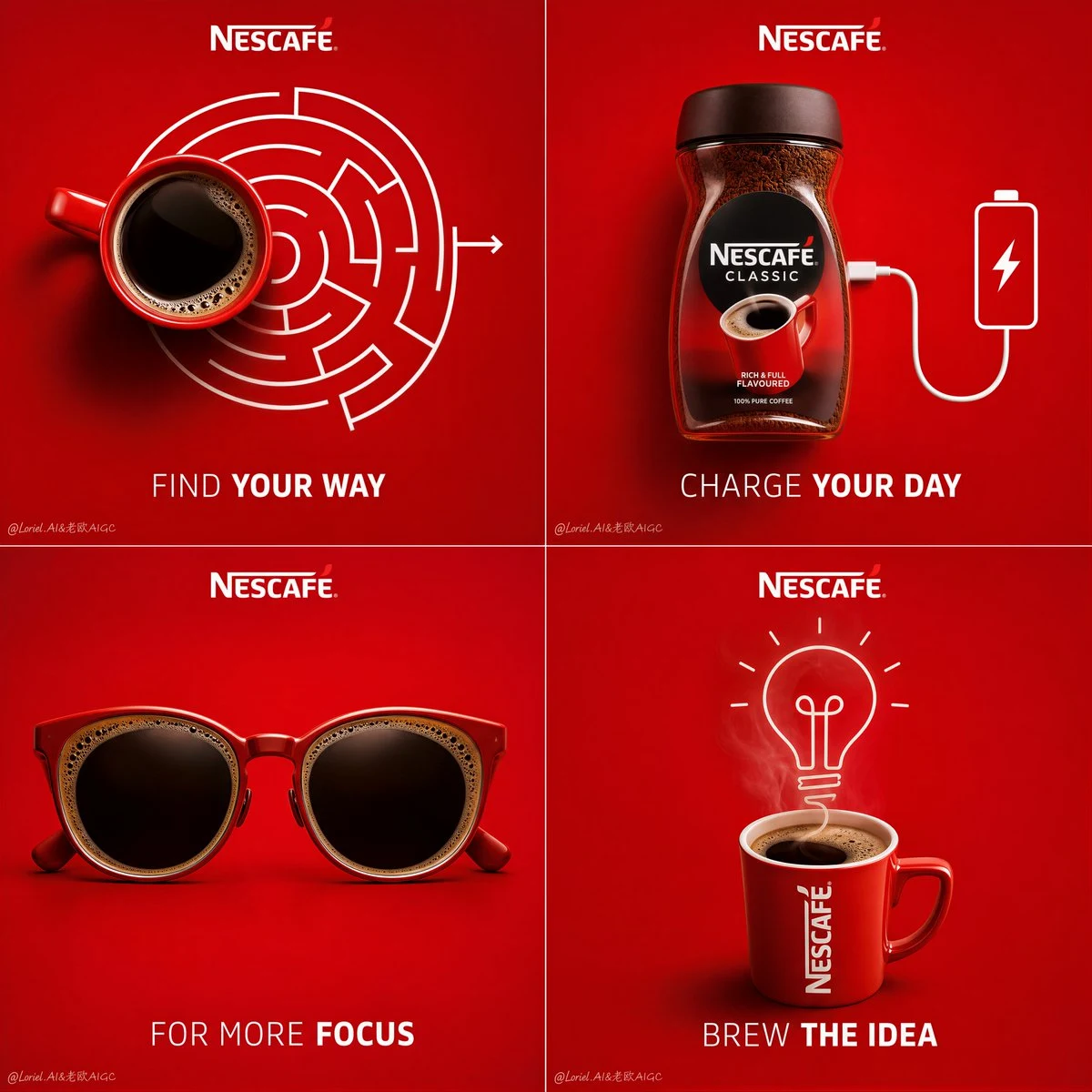
Create a premium 4-panel campaign poster for Nescafé, built as a clean 2x2 grid of minimalist conceptual coffee ads. Each panel must feature a real Nescafé product or real coffee cup as the central hero, combined with a witty visual event or object transformation directly related to coffee. The overall composition should feel highly organized, brand-consistent, modern, and clever, with all four panels sharing the same saturated Nescafé-red background, premium lighting, minimal layout, and strong visual simplicity. The entire campaign should feel like one unified idea expressed through four different coffee moments.

Overall layout:
Use a perfectly balanced 2x2 square grid, each panel framed like an individual premium ad card within one larger poster. The background of every panel should be a rich saturated Nescafé red with subtle tonal variation and soft studio depth. Keep the whole design extremely minimal and clean, with generous negative space. Each panel contains one real coffee object and one clever event, transformation, or visual metaphor built around that object. Add the Nescafé logo consistently at the top of each panel, with short English taglines beneath or near the central visual.

Panel 1 – Wake:
A real top-view coffee cup becomes the starting point of a simple maze or route system, suggesting that coffee helps you find your way into the day. The cup should be rendered with extreme realism, rich black coffee surface, subtle crema details, and premium ceramic texture. The maze or route should be minimal white linework, highly graphic and clean, integrated naturally with the cup.

Panel 2 – Charge:
A real Nescafé jar or cup is visually connected to the idea of power or charging. For example, the product may be linked to a charging cable, battery icon logic, or a clean energy metaphor, but executed in a premium minimalist way. The product remains fully realistic, clearly readable, and visually dominant. The event must feel smart and instantly understandable, not gimmicky.

Panel 3 – Focus:
A real coffee cup or pair of coffee-filled sunglasses creates a visual metaphor for concentration, alertness, or mental sharpness. The object transformation must feel elegant and witty, with realistic coffee surface details and refined shadows. This panel should feel slightly more fashion-like and graphic, but still consistent with the system.

Panel 4 – Create:
A real coffee cup becomes the source of creativity through a clean event connected to steam, linework, or idea generation. For example, steam can subtly evolve into a lightbulb, idea sketch, signal line, or abstract brain-like shape. The visual must remain minimal and premium, with the coffee cup as the anchor and the event as the conceptual payoff.

Visual language:
Each panel must combine hyper-realistic product photography with very restrained white line graphics or minimal object transformations. The linework should feel polished, premium, and intelligent, never childish. The coffee objects should always remain the visual hero. The event or metaphor should look as if it naturally grows out of the product.

Branding and typography:
Use English as the dominant title language. Place the Nescafé logo clearly in each panel. Add a short, punchy English tagline for each concept, for example:
Panel 1: “Find Your Way”
Panel 2: “Charge Your Day”
Panel 3: “For More Focus”
Panel 4: “Brew the Idea”
Typography must be minimal, well-spaced, bold in hierarchy but still elegant, with no clutter or cheap poster styling.

Lighting:
Use polished commercial product lighting across all four panels. Coffee surfaces should have subtle reflections and realistic depth. Cups and jars should cast soft, clean shadows. The white graphics and visual metaphors should remain crisp and beautifully integrated. The entire campaign should feel premium, graphic, and expertly art-directed.

Mood:
minimal, clever, energetic, modern, premium, brand-forward, memorable, witty, editorial.

Rendering style:
hyper-realistic commercial coffee product photography combined with restrained conceptual white-line graphics, premium 4-grid campaign poster, saturated monochrome red branding background, elegant typography integration, polished advertising lighting, 8k, sharp but clean finish.

Negative prompt:
messy layout, cluttered props, weak product focus, low-detail coffee cup, cheap infographic style, childish doodles, flat lighting, distorted branding, random unrelated objects, low-end coffee ad, noisy composition