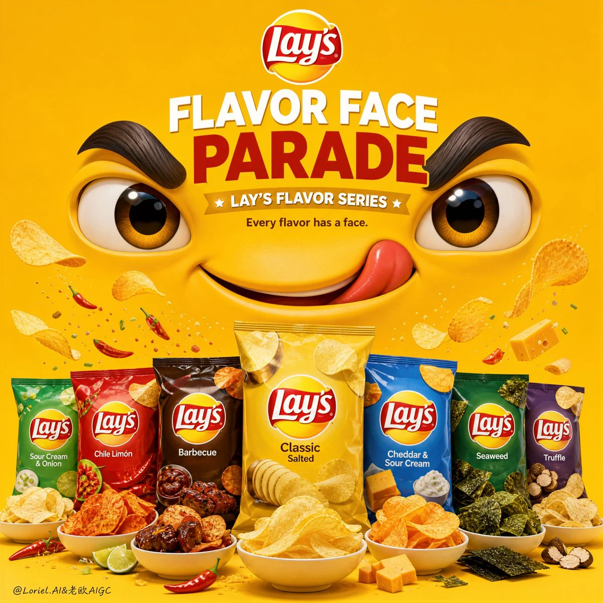
Create a premium vertical campaign poster for Lay’s potato chips series, “Lay’s Flavor Face Parade” edition, built around a bold minimalist composition with a giant original cartoon collaboration face dominating the upper half and a beautifully ordered product-series parade in the lower half. The image must feel vibrant, playful, premium, and instantly social-media friendly, like a flagship global snack campaign visual with strong collectible character energy.

Overall composition:
Use a clean vertical poster layout with a highly saturated monochrome background in a vibrant Lay’s-inspired yellow or rich golden snack color. The top half of the image is dominated by one oversized original cartoon face, while the lower half presents a lineup of multiple real Lay’s product variants in an elegant parade-like arrangement. The composition should feel balanced, playful, and strongly hierarchical, with the character acting as the emotional hook and the products acting as the tangible commercial anchor.

Character design logic:
Create one large self-designed collaboration mascot face that feels iconic, simple, and emotionally expressive. The character should have oversized eyes, stylized brows, and a confident or cheeky smile, rendered in a clean premium 3D-meets-graphic style. The expression should communicate joy, crunch satisfaction, and playful attitude. The character must feel collectible, modern, and suitable for a flavor-collaboration series, without referencing any existing IP. Its face should visually “watch over” the lineup below like the host of the flavor parade.

Flavor parade logic:
Arrange several real Lay’s product variants in the bottom section in a polished, parade-like lineup. The products can appear as real chip bags or elegantly presented chip bowls representing different flavors in the series, such as classic salted, spicy chili, barbecue, cheese, sour cream, seaweed, or regional special flavors. The arrangement should feel like a celebration of variety and flavor energy, not just a static row. Use slight rhythm in height, spacing, and chip overflow so the lineup feels lively and festive while remaining clean and controlled. Add a few floating chips, crumbs, or flavor-colored accents above the lineup, rising upward like confetti in a parade.

Snack realism:
All products and chips must be rendered with extreme realism. The chips should look crisp, golden, textured, lightly curved, and appetizing, with visible seasoning variation by flavor. The packaging or bowls should be clean, glossy, and premium, with clear brand readability. Floating chips must feel light and dynamic, but carefully art-directed, never chaotic.

Graphic and parade atmosphere:
Subtly enhance the sense of a flavor parade by using elegant motion rhythm in the chip placement, tiny flavor bursts, light floating crumb arcs, or refined graphic spacing that suggests movement and celebration. Keep the background itself minimal and uncluttered. The parade energy should come from the arrangement, the floating chip details, and the character’s strong presence, not from random decoration.

Branding and typography:
Use English as the main title language. Integrate the real Lay’s logo prominently but tastefully. Build a strong campaign headline such as:
“FLAVOR FACE PARADE”
or
“CRUNCH IN CHARACTER”
or
“ONE PARADE. MANY FLAVORS.”
Add a smaller supporting line such as:
“Lay’s Flavor Series”
or
“Every flavor has a face.”
Typography must be bold in hierarchy, playful but premium, and perfectly integrated into the face/product structure. No crude fonts, no cheap snack-ad clutter.

Lighting:
Use polished commercial lighting. The large face should have soft dimensional shading and premium highlight control. The products and chips should be brightly appetizing, with clean shadows and crisp snack texture. The overall poster should feel glossy, vibrant, and expertly art-directed.

Mood:
playful, bright, collectible, flavorful, graphic, premium, cheerful, social-friendly, memorable, brand-forward.

Rendering style:
hyper-realistic commercial snack product photography combined with a polished original cartoon collaboration character, premium FMCG campaign poster, highly saturated minimal background, elegant typography integration, soft glossy commercial lighting, 8k, sharp but playful finish.

Negative prompt:
messy composition, low-detail packaging, cheap cartoon style, cluttered background, dull colors, weak product focus, distorted Lay’s logo, greasy chips, random props, low-end snack advertisement, too many visual effects, ugly fonts